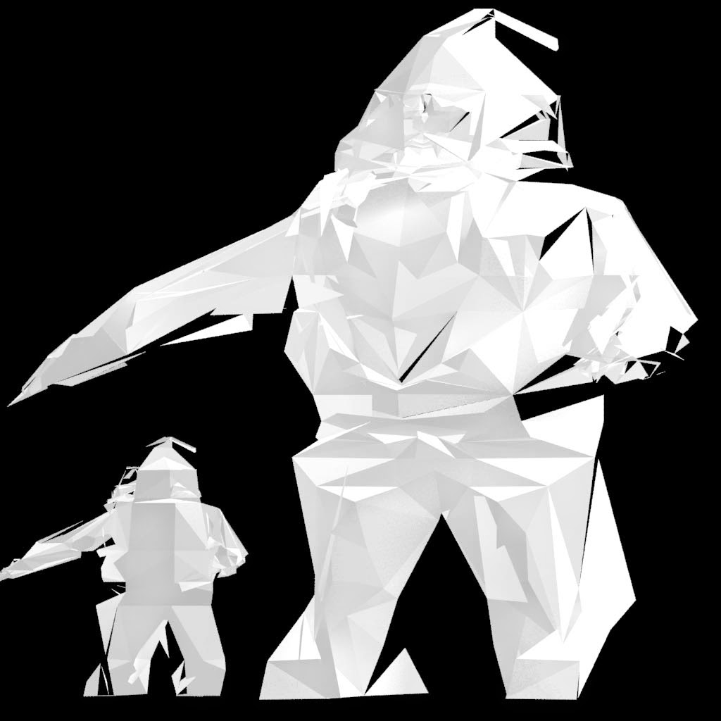
Brief: "is to produce an image featuring Santa Claus that will be used as a CGA Christmas card."
Inspiratation:
I was really inspired by "Low Poly trend", not something in Video Game circles, but 3D stills, for advertising and other media. These designs are very simplistic color and design wise but really on geometric shapes to add interest and create detail. The Low Poly trend, also had a lot of soft lighting and light paper textures.
I was also interested by 3D type and scene layout; although with the small Christmas cards meant a small canvas i knew i had to keep it small and punchy.
So I started with box model then then used the cut tool to insert all kinds of geometry, the legs and chest went quite well.
The face however didn't go to well and got to out of control
I went through a lot of iterations trying to fix all the issuses and going back and working it again, yet the problem wasd to deep and in-grained
Instead of using the Slice and Cut tools, I inserted edge loops and keep the design faceted and simple
Although still had issues
Final WIP
Due to excessive topology, no edge loops and overlapping. The textures and UV's didn't come out very well. I tried using Mudbox's paint tool to account for the problems, but i could not help me.
unsucessful AO renders:
Final Renders:
I applied a dark grey texture and added in a Sky Light to illuminate and create crisp shadows on the faceted topology.
Overall I was quite happy with the final renders, they do lack a bit of christmas colour, however they do capture my original intentions
Even though i encounter the alot of problems with this chosen design, it did teach me a lot.
By doing the complete opposite of what I had been taught in Video Game 3D, I learnt about the Cutting and Slicing tools. Why bad geometry is bad, how to avoid bad geometry.
I will definitely revisit this next year, as still inspired the style and there is still a lot to learn from making mistakes.


No comments:
Post a Comment